Your Pocket Camera Can Sell the Business: A No-Spend Website Photography Guide

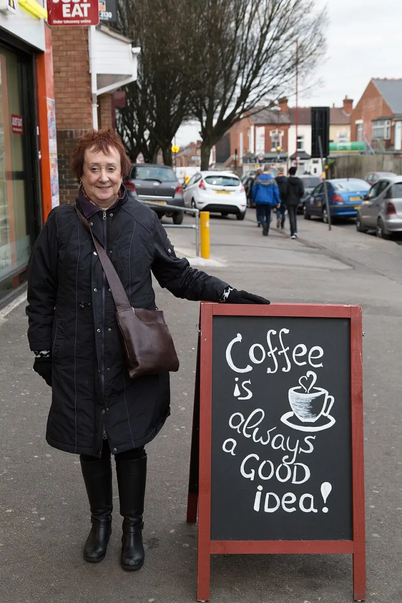
Photo: Gage Skidmore, CC BY-SA 3.0, via Wikimedia Commons
Most UK small business websites do not fail because the photos are too low-resolution. They fail because the photos are inconsistent. One shot is dark, the next is orange, the third has a cluttered background and the fourth looks like it was taken in a hurry before closing time. Visitors do not consciously analyse that, but they feel it. The site looks less trustworthy than the business actually is.
The good news is that your phone is no longer the weak link. In 2026, even a mid-range handset can produce website-ready images. The trick is to stop treating photography as a creative mood and start treating it as a small, repeatable process.
Clean the lens, switch on the grid and ignore the flash
Start with the boring basics. Wipe the camera lens with a microfibre cloth. Turn on the grid so you can keep horizons straight and place subjects consistently. Leave the flash off unless you genuinely know why you need it; on most phones it flattens texture and makes interiors look like a crime scene.
Tap the screen to focus, then lock exposure if your phone allows it. Do not use digital zoom. Move closer instead. If you need a tighter crop, take the photo with room to spare and crop later. Burst mode is useful for people and pets; for products, take three or four frames and pick the sharpest.
Use a window, not the ceiling light
The single best free light source in the UK is a window. Put your subject beside it, not in front of it. Side light gives shape and texture. Front light is flatter but safer for headshots. Avoid direct midday sun, which creates hard shadows and squinting. British winter light is soft but weak, so shoot earlier in the day rather than at 4pm when the light has given up.
If the light is too harsh, tape a sheet of baking parchment over the window with low-tack tape. It is a diffuser, not a permanent fixture. If one side of the subject is too dark, prop a piece of white A3 card or foam board opposite the window to bounce light back in. A black bin bag or dark card on the other side can add depth by stopping light bouncing where you do not want it.
Build a £0 kit from the kitchen drawer
You do not need much. Gather white A3 paper or foam board, baking parchment, bulldog clips, an ironed tea towel, a black bin bag, a few books and a clean wall. That is enough for most product, headshot and detail shots. Skip the cheap ring light if it makes everyone look like a startled ghost. Daylight plus a white board is usually better.
For smaller items, make a simple light tent: a cardboard box with the sides cut out, lined with baking parchment, with white paper inside as the base. Put it beside a window and shoot through the open front. It will not match a professional studio, but it will look clean and consistent on a website.
Frame for trust, not for art
Website photography has a job: reduce uncertainty. Show the thing clearly, show the scale, show the detail and show the person behind the business. Keep the camera at roughly eye level for people and at the product's level for objects. Weird angles are fine for a portfolio; they are less fine when someone is trying to work out what they are buying.
Choose one crop ratio and stick to it. Square images work well for product grids and team photos; 4:3 or 3:2 works for interiors and job shots. Leave space around the subject so text can sit beside the image without fighting it. If you are shooting a headshot, ask the person to stand a step away from the wall, turn slightly towards the window and look at the lens, not at the phone screen.
Backgrounds by business type
For trades, show the van, the tools and the finished job, but tidy the frame first. Move the coffee cup, the random cable and the paperwork. Check number plates and house numbers if you do not want them published. A clean van with the logo visible is more useful than a dramatic shot of a spanner in low light.
For cafés, shoot near the window before service or after the lunch rush. A flat white on a clean table with the menu softly out of focus is fine; a cluttered counter with till receipts is not. Ask customers before including them. If in doubt, shoot hands, cups and interiors rather than faces.
For consultants, a plain wall and a window at 45 degrees will beat a messy bookshelf. Wear something you would actually wear to a client meeting. Take one headshot and one working shot at a desk, but hide confidential screens and remove the takeaway cup. For makers, keep colours accurate. Do not over-edit a ceramic glaze until it looks like a different product. Use white paper, daylight and a simple background, then check the photo on a different screen.
Before and after: the café flat white
Before: overhead ceiling light, phone held at chest height, cluttered counter behind, flash on. The coffee looks grey, the background is busy and the image feels like a snap.
After: table moved beside the window, white board on the opposite side, phone at 45 degrees, counter clutter cleared, flash off, square crop. The cup has shape, the surface has texture and the background is quiet. Same phone. Same coffee. Better decisions.
Compress before you upload
A 12-megapixel phone photo is not a website image. Resize the long edge to around 1600 to 2000 pixels, export as JPEG at roughly 75 to 85 percent quality, or use WebP if your site supports it. Tools such as Squoosh and TinyPNG are free. If you use WordPress, an image optimisation plugin can help, but do not use it as an excuse to upload enormous files.
Name files sensibly: cafe-flat-white-london.jpg is better than IMG_4832.jpg. Fast pages feel professional. Slow pages feel like hard work.
Alt text is not a keyword dumping ground
Write alt text that describes the image's purpose. For a product: 'Handmade blue ceramic mug with a speckled glaze.' For a team photo: 'Two members of the cafe team behind the counter.' If an image is purely decorative, use empty alt text. Do not stuff in 'best cafe London coffee beans' and hope Google is impressed. It rarely is, and screen reader users have to listen to it.
A simple shoot routine
Make a list of six shots: exterior or sign, interior or workspace, team or owner, product or service close-up, a detail shot and a finished-job or happy-customer shot. Shoot them in one session with the same light and background. Consistency is what makes a small website look considered. You do not need a studio. You need a window, a tidy frame and twenty minutes of patience.