The Handover Page: What Happens After Someone Presses Send

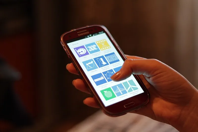
Photo: Francisclarke, CC BY-SA 4.0, via Wikimedia Commons
Most of us have done it: fill in a form, press send, and land on a page that says “Thank you” in a large font. Then nothing. No clue what happens next, no idea whether the message actually went anywhere, and no easy route back to anything useful. It is a small moment, but it is one your visitor will remember.
The page after the button is not really a receipt. It is a handover. Someone has just trusted you with their details, their booking, or their order enquiry. Your job is to make the next few seconds feel clear, calm and worth the click.
The attention window is short, so use it kindly
A confirmation page is one of the few places on your website where you are not competing with the rest of the internet. The visitor has already done the thing you wanted them to do. They are not browsing anymore. They are checking.
That makes it a poor place for a hard sell and a very good place for reassurance. Keep the page focused on what just happened and what happens next. If you can answer the little worries — Did it send? When will I hear back? What should I do now? — you have done your job.
Lead with a promise you can actually keep
A clear response-time promise is worth more than a paragraph of gratitude. “We will reply within one working day” is useful. “We will be in touch shortly” is not. If you are a one-person business and you do not work weekends, say so. Honesty here prevents the follow-up email that starts with “Just checking you got my message?”
Put the promise near the top, in plain English. Add your working hours if they matter. If the enquiry needs a specialist answer and might take longer, say that too. A realistic promise builds more trust than an optimistic one you miss.
Give them one useful next step
After the reassurance, offer a single sensible route onwards. Not five. One.
For a brochure site, that might be a link to a relevant project, a services page, or a short guide that helps them prepare. For a booking form, it could be a link to joining instructions or a page about what to expect. For click-and-collect, it should be the collection details: where to go, when to come, and what to bring.
A phone number can be useful here, especially for trades and local services, but only if someone can answer it. If the number goes to a voicemail that is checked twice a week, it is not reassurance. It is another dead end.
Do not turn it into a second sales pitch
The visitor has just committed. This is not the moment to push an upgrade, a newsletter sign-up, a limited-time offer and a survey all at once. A gentle link back to useful pages is fine. A pop-up asking them to subscribe before they have even read the confirmation is not.
Think of it as a handover at a shop counter: you confirm the order, explain when it will be ready, and point them towards the door. You do not follow them into the car park with a brochure.
A simple checklist for three common forms
Brochure site enquiries
- Confirm the message has arrived and give a realistic reply time.
- Repeat the best phone number or email for urgent questions.
- Explain what happens next, such as a short call or a written quote.
- Offer one relevant link, perhaps to a portfolio, FAQ or preparation guide.
- Tell them they can reply to your email if they remember something later.
Booking forms
- Show the date, time and location clearly, not just a generic thank you.
- Explain whether the booking is confirmed or awaiting approval.
- Include what to bring, who to ask for, and the cancellation policy.
- Add a practical link, such as directions or joining instructions.
- Keep the page available so they can return to it later.
Click-and-collect enquiries
- Repeat the order or enquiry reference if you have one.
- State the collection window and address in full.
- Make it clear whether they should wait for a “ready” message.
- List anything they need to bring, such as a confirmation email or ID.
- Give a phone number for collection questions and say when it is answered.
Accessibility basics that stop the page becoming another leak
A confirmation page can undo a good form if it is hard to use. Start with a real heading, not an image of the word “Thanks”. Move keyboard focus to the top of the page or to a success message so screen reader users know something has changed. If you use a status message, make sure it is announced properly rather than appearing silently.
Do not rely on colour alone to show success. Use clear text as well. Keep the layout readable on a phone, avoid timed redirects, and if you must redirect, give people enough time and explain what is happening. A confirmation page should feel like the end of a conversation, not a trapdoor.
Spam protection and privacy without the hostility
You do not need to make the thank-you page suspicious of everyone. Use a honeypot field, a simple time check and server-side validation to catch the obvious rubbish. If you need a CAPTCHA, choose one that works with keyboards and screen readers. Do not put personal details in the page URL, and mark confirmation pages as noindex so they do not turn up in search results.
Also resist the urge to display the full contents of someone’s enquiry on a public page. A reference number and a short summary are usually enough.
Keep it small, keep it honest
You do not need confetti, a countdown or a cartoon tick. You need a page that tells the truth about what just happened and what comes next. Test it on a phone, read it out loud, and ask whether it would calm you down if you were the customer.
The page after the button is not the end of the journey. It is the moment your website stops taking and starts handing over. Get that right, and the next email or phone call is much easier for everyone.