Built for the Bus Stop: Making Your Small Business Site Work One-Handed
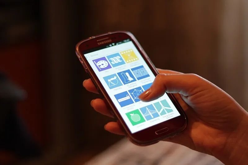
Photo: Océanos y dados, CC0, via Wikimedia Commons
Picture the moment someone visits your website. They are not at a desk with a mouse and a fresh coffee. They are on the top deck of a bus, holding a rail with one hand and their phone with the other. Or they are on the sofa, half watching something, thumb hovering over the screen. Or they are on your shop floor, trying to check whether you have the thing they can see in front of them. Mobile design is not about looking modern in a screenshot. It is about making the next step obvious when someone has one thumb and limited patience.
The one-thumb test
Pick up your own phone. Hold it in one hand. Now try to do three things on your website: call you, find your opening hours and buy or enquire about something. Notice where your thumb naturally rests. On most phones, that is the lower half of the screen, slightly towards the side you are holding. If your key actions live in the top corners, you are asking customers to shuffle their grip or use two hands. They might do it once. They will not do it happily.
The fix is not complicated. Put the most important action within easy reach. A sticky call button at the bottom can work well for service businesses. A clear 'Add to basket' or 'Get a quote' button should sit where a thumb can hit it without a stretch. Test it while standing up, because that is closer to real life than sitting at a desk.
Tap targets are not a design nicety
Small links are a quiet form of friction. A phone number that is not tappable, a menu item that is 20 pixels tall, or two buttons packed so closely that you hit the wrong one: these are the things that make people give up. Make buttons and links comfortably large, with space around them. Phone numbers should dial when tapped. Email addresses should open a mail app. If you have a map, make it open in the customer's preferred maps app rather than a tiny embedded box they cannot pinch.
This is not about dumbing down your design. It is about respecting the fact that a thumb is wider than a mouse pointer. A little padding goes a long way.
Keep the next step sticky, but not clingy
A sticky bar at the bottom of the screen can be brilliant for a small business. It might say 'Call us', 'Get a quote' or 'View basket'. It keeps the next step visible without making people scroll back up. But it should not cover your content, hide your cookie notice forever, or take up half the screen. Keep it slim, label it clearly and check that it disappears when someone is trying to fill in a form. The best sticky bar feels like a helpful shortcut, not a billboard following you around.
Menus should be findable, not clever
The hamburger menu is fine. Most people know what it is. But do not rely on it for everything. If someone's main job is to call you, show a phone icon. If they need to find your shop, show an address or a 'Find us' link. If you have a search box, keep it visible. Clever hidden menus often fail the bus-stop test because they ask the customer to stop, open a menu and work out where to go next. Clear labels beat cute icons almost every time.
Short forms win on sofas and shop floors
A long contact form is a commitment. On a phone, it feels like homework. Ask for the minimum: name, contact detail and one question. Use the right keyboard for email and phone fields. Turn on autofill where your platform allows it. If you need more information, ask for it after the first reply, not before. A quote form that takes 30 seconds on a phone will beat a beautifully designed form that takes three minutes and asks for a company registration number before the customer has even said hello.
Checkout friction is a thumb problem
If you sell online, test the checkout on a real phone over mobile data. Guest checkout should be easy to find. Apple Pay and Google Pay can remove a lot of tapping if your platform supports them. Delivery options should be big enough to read and tap. Error messages should say what went wrong in plain English, not flash red and leave the customer guessing. Postcode lookup is helpful, but only if it works for the addresses your customers actually have.
Ask someone else to buy something while you watch. Do not help. You will see where their thumb hesitates, where they squint, and where they put the phone down in frustration. That is better research than any design trend article.
Three tests you can run this week
First, do the one-thumb test on your own site. Can you call, find hours and enquire without changing grip? Second, load your site on mobile data in a busy spot. Does it appear quickly enough, or are you waiting on a hero image the size of a billboard? Third, hand your phone to a friend or colleague and ask them to find one thing. Watch their thumb, not their words.
Mobile design is not about chasing a fashionable look. It is about removing hesitation. For most UK small businesses, that means a few affordable changes: a bigger button here, a shorter form there, a phone number that actually dials. Do those, and your website starts working for the way customers really hold their phones.